In this LA we were given the task to create a poster for a band named The Keystrokes. We had to include varius informations in this poster, and then later expand the poster to a pamphlet that show even more information about the tour the band is going on. This is what I made based on my ideas of the whole assignment;


Learning Activity: Understanding Ideals
Chosen store: Cubus
1: The logo for Cubus is a very simple and easy logo. A straightforward word with rounded corners with either a black or white color, depending on where it is (i.e on back of a shirt or the front of the store)
This is a nod, to me at least, to their image of themselves that they are an easy and straightforward store with simple ideals.
Other than that there are no outstanding design details on the logo.

2: Cubus’ brand ideal seems to me to be a simple one; Availability, affordability and simplicity.
They have this range of clothes that singles no one out. It’s a cheap store that sells all kinds of clothes. Male, female, kids, fat, thin, short, tall, formal, casual and so on. Most other stores limit their stock to have more focused groups, but Cubus has a thing for including everyone with a cheap price tag.


3: Within the shop I went to I found a whole bunch of clothes for everything I could need. I went from swimwear to jackets, kids’ clothes to formal attire for men etc. Most of these ranged from medium to low in price compared to others I went to that singled out men’s clothes (for example). Most of the things I found were simple clothes (plain-colored t-shirts, simple sweatpants etc) and had a very reasonable price tag on. I even ended up buying 4 T-shirts and a hoodie.

4: From my experience actually going to the store to research (and actually ending up buying 5 things) this is what I found in total:
When I first entered the store, I was met with a sea
of clothes from one end to the next. One side was for men, the other for women’s
clothes. At the entrance there were quite a few items ranging from jackets for
599 or multiple showings of sweaters and pants for 299.
When looking around and thinking about their ideal of Availability,
affordability and simplicity, I was not met by any opposition to those words. I
found a huge amount of clothes for each occasion, temperature, size, color and
price. The prices were already at a very reasonable price as it was, but they
also have constant sales to normal wear such as underwear, t-shirts, socks etc.
When I asked the clerks, they said that the sales are a reflection of the
constant need the customers have for such items, and thus is always available
at a price that is deemed good and beneficial to the customer.
All in all, I think that Cobus live well up to their ideal and I also believe that they show it full well in their stock, visual displays and prices.


Learning Activity: Create a logo using Gestalt Principles
The logo of Unilever uses the principle of Proximity and Closure in it. All the tightly pressed together figures make up a clearly noticable * U * letter and is why Proximity is used in making this logo.
And the use of Closure is shown with the areas between the tightly-pressed figure. All the small areas between those are the spaces that our brains connect to the entirety even though it is blank.
The last part of the logo, the text, uses Continuity. We follow the lines until we find a new object.
The last part was to create our own version of this logo using our chosen Design Principle. I went with a Common Fate logo using graphics of birds going in a flock and following a pattern. This can also be said to have both Closure and Proximity in it as well.
My creativity with this one was not my best in any way, shape or form. It fit what we were given as an assignment, but I can do a lot better, and from now on, and from now on will try to do so.

My research, sketches, etc were minimal and simple.


Learning Activity: Understanding Positioning
Understanding Positioning:
In this Learning Activity we got three point to complete; The first was to explain the positioning of the three logos shown (pictures below), the second was to take Apple iPhone logo and reserach and explain some of the brands identities, positioning, strategy etc. The third and last was to explain the iPhone logo fits with the brand identity.
Part One: Positioning

Instagram:
The logo shows simple and expressive colors with forms that
make up what they want to show themselves to be; a visual representative on the
internet. Instagram is a visual social site that focuses on pictures, videos,
illustrations and the like. The form the logo takes, from the playful colors
and figures is indeed a camrea; the icon for what they show in the page.
Instagrams positioning in my eyes seems to be an innovating, modern and simple
way to connect people trought the most expressive ways; namely pictures. A
modern take on the sharing and connection service that Facebook provides, only
with the newer aspects of the younger generation in it.
A hip and modern page for people to share their lives and experiences through expressive
forms.

Mercedes:
Mercedes is in my eyes a professional and strong logo that gives the impression
of reliability and quality of product.
The logo is a strong and sound symbol with only two object that make it up; a
circle and a three-pointed star. It is very firm and professional, straight to
the point, and is one of the reasons I feel a strong sense of quality and
reliability when I see it.

Mastercard:
Mastercard seems to be a titan in the world of transactions and payment. It is
a credit/debit-card company that pushes the boundaries for the smartest,
easiest and most profitable connections between the company and its consumers.
Part Two: Apple iPhone
The iPhones brand identity is for me a clean, innovative,
modern and advanced piece that strives to be at the top of its field. Its
design made for simplicity, trendy, user-friendly and strong is second to none.
The logo is an apple with a bite taken out of it and represents Knowledge, in
reference to the Apple of Eden. This is their tell to them using the best technology
available, and giving us a reassurance of getting the best product out there.
The colors used in both the iPhone and logo is simple and clean contrasts (black
logo, white phone) that makes it look modern and friendly to the eye.
Current Positioning:
The current positioning of iPhone is one of luxury. The current new iPhones are a expensive and luxurious piece of techonological advancements with top quality parts and design. Its at the top of its field and will always get people to buy the newest addition to the iPhone family each year no matter the price. People pay for quality, and everyone knows that iPhone is a top quality modern piece that gives you a status phone.
Strategy for Product:
The strategy of the iPhone is manyfold, such as it is with all products out there. It focuses on the improved experience for the users.
In the past Apple released iPhone products bi-yearly with sub-titles to existing titles in-between the years of the main titles. Then after the next main title comes the next year, the cycle repeated. These major titles that were released were the call to those who stay with Apple to change to the new and better device now out. This has changed a little in the later years with Apple now releasing main titles every year, and instead of bi-yearly sub-titles to already existing ones, they release the new phone with an *premium* edition of the phone itself that cost more.
Since iPhones are not actually marketed towards all earning-classes they make up for this by giving the phones three different storage options, each with a different price-tag. This eliminates the substantial loss they would have made to only making one phone with one price, and thus capitalizes on this to gain even more money.
Research:
When Apple created the iPhone they had a lot to research and consider before releasing a full product.
Some of the things I believe they had to research were the market for these new touch phones in general. It was an unknown thing to the world, but many of the touch phones at that time did not have the best reputation of stability and reliability.
They had to research which market to releaset his new device in. Jobs expressed his concern for going in the PDA market with the iPhone, as he thought it would be a bad match for it. Apple aso knew that this were not going to be the first phone to have email, mobile Web, and touch-screen, but they had to make up for it with the improved user experience and interface for the users and so had to get a good grasp on the different interfaces and phones out there already using these.
Part Three: Logo

The Apple logo has gone through many iterations over the years, but the current one is a modern, *flat*, single colored and simple apple.
Based on the identity of the brand the logo has many interpretation of meaning, such as;
-Apple that hit Issac Newtons head. The man who revolutionized science forever.
-The Apple of Eden, symbolizing Knowledge.
-Alan Turing, the modern computings father, that ate a poisoned apple that led to his death.
No matter how you interpret it, this logo represents knowledge and a drive force to the future.
The colors of the logo is plain white, black or grey/silver. It is a simplified modern logo with no intense forms or shapes. It feels as *clean* as the design and experience that the company is going for when making the products themselves.
Learning Activity 03: Sketching Techniques
In this Learning Activity we were given the job of sketching out at least 15 different ideas for a label of a juice packet called «Loose Juice» that had the taste of Orange and Banana. Then we were to choose one of our sketches and make it in Adobe Illustrator for a full product.
Below are my 15 sketches of what my idea was going to be like.


And here is my finished product:
I went with the idea that the juice was sort of like a kids juice packet, and thus had to have some childish and fun colors and elements to show this.

Mandatory Assignments, Project Exam and Portfolio
Mandatory Assignments:
00 – Deliver Work Methods at 18/8 Midnight
01 – Deliver Design Principles at Friday, Week 3 – 4pm
02 – Deliver Logo at Friday, Week 7 -4pm
03 – Deliver Layout at Friday, Week 13 – 4pm
04 – Deliver Photography at Friday, Week 18 – 4pm
05 – Deliver at Friday, Week 22 – 4pm
06 – Deliver Photography 2 at Friday, Week 24 -4pm
07 – Deliver at Friday, Week 34 – 4pm
08 – Deliver Branding and Packaging at Friday, Week 31 – 4pm
Project Exam:
Deliver Project Exam at Friday, Week 39 – 4pm
Portfolio:
01 – Deliver Portfolio 1 at Friday, Week 18 – 4pm
02 – Deliver Portfolio 2 at Friday, Week 40 – 4pm
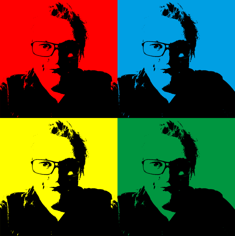
Learning Activity – Moodle Illustration

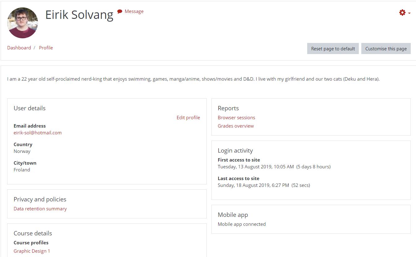
Learning Activity – Moodle Profile
Here is my new and updated Moodle profile. This is part of our first assignment, and with this I now feel like an official student.
Learning Activity – Forum Presentation

Background
A Journey to Now
Be yourself; Everyone else is already taken.
— Oscar Wilde.
I am a 22 year old man who has been going back and forth on what he wants to do. I studied at Sam Eyde VGS with Media, but after that I turned to teaching to see if it was for me. I quickly found out it was not what I wanted, so I started working and had a break from my studies. After 1.5 years, me and my girlfriend started studying Multimedieteknologi og Design at UiA Grimstad. With many of the classes being a far reach from what we thought the study should be about, we quit that and now I am here at Noroff studying to be a Graphic Designer. I decided to go here because it is a place that focuses specifically on one thing and that is something I have been missing when going to other studies. There are things that interest me more than others, and when my girlfriend notet to me that this was an option of study, I jumped at it.
I have always had an interest working with media stuff from video, photo, sound, graphic and others. This is one of those things to me that I would really like to get better and better at to such a point that I can be proud of the things I make (and maybe teach it on in the future).
I hope to use this to get a career of something that I think is amazing and fun at the same time as being fulfilling and worth every second of my time.